Ephemera
Type of Work
Prepress & Print
Publication
Typography
Prepress & Print
Publication
Typography
Date
2021
2021
Brief
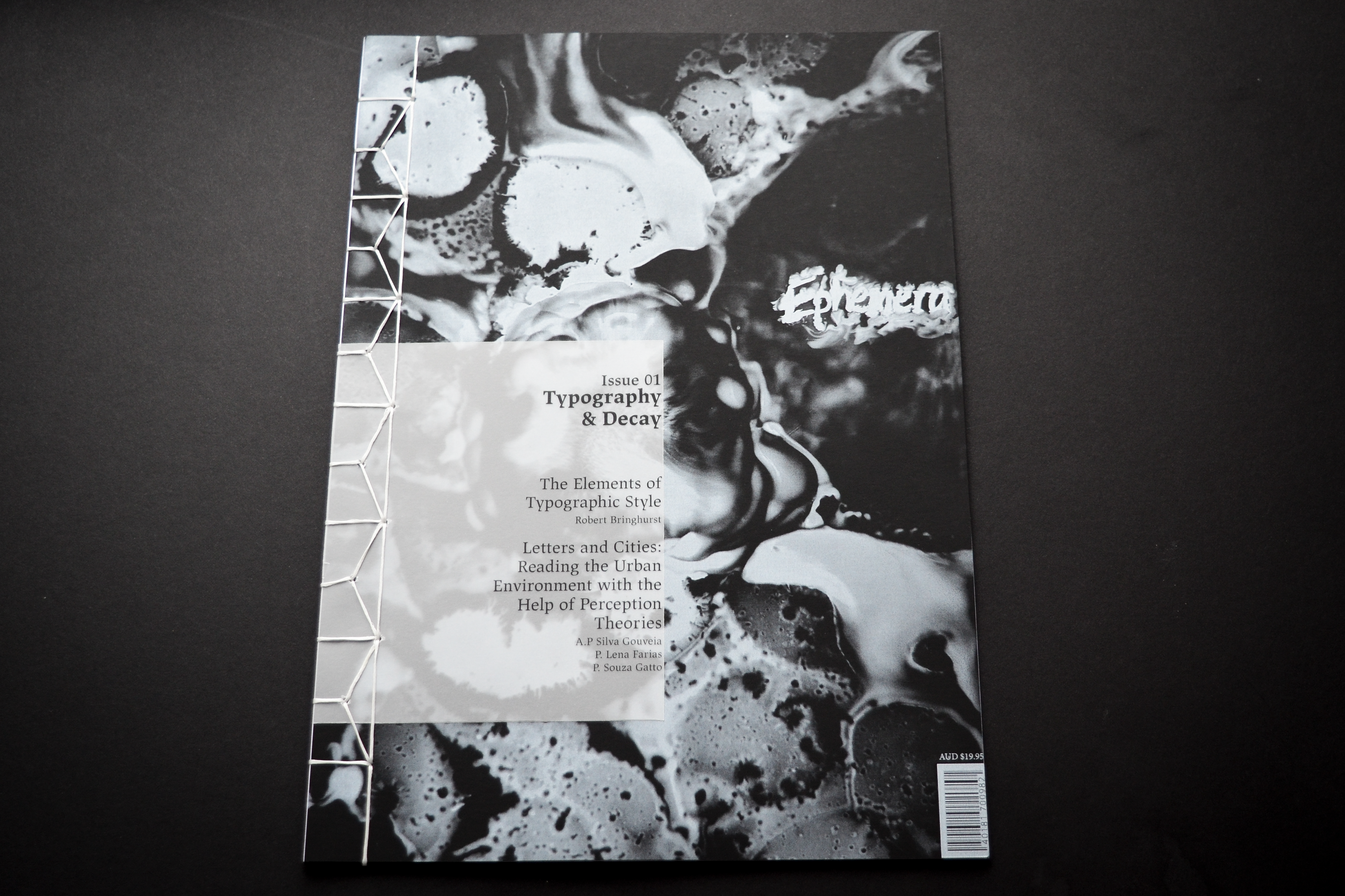
Ephemera is a mockup design publication based on two featured readings: The Elements of Typographic Style and Letters and Cities. The concept explores the idea that urban identity is shaped by the interactions between people and their surroundings, creating the social and cultural spaces that connect the past with the present. The decay and ephemeral nature of forgotten typography can embody these human characteristics, revealing how our relationships and interactions with the world have evolved over time. Ephemera highlights how these changing relationships reflect human connections—both past and present—with urban and domestic environments. The title Ephemera captures both the fleeting and transient nature of these connections, as well as the fragility of printed works and typography.
Ephemera is a mockup design publication based on two featured readings: The Elements of Typographic Style and Letters and Cities. The concept explores the idea that urban identity is shaped by the interactions between people and their surroundings, creating the social and cultural spaces that connect the past with the present. The decay and ephemeral nature of forgotten typography can embody these human characteristics, revealing how our relationships and interactions with the world have evolved over time. Ephemera highlights how these changing relationships reflect human connections—both past and present—with urban and domestic environments. The title Ephemera captures both the fleeting and transient nature of these connections, as well as the fragility of printed works and typography.
Strategy
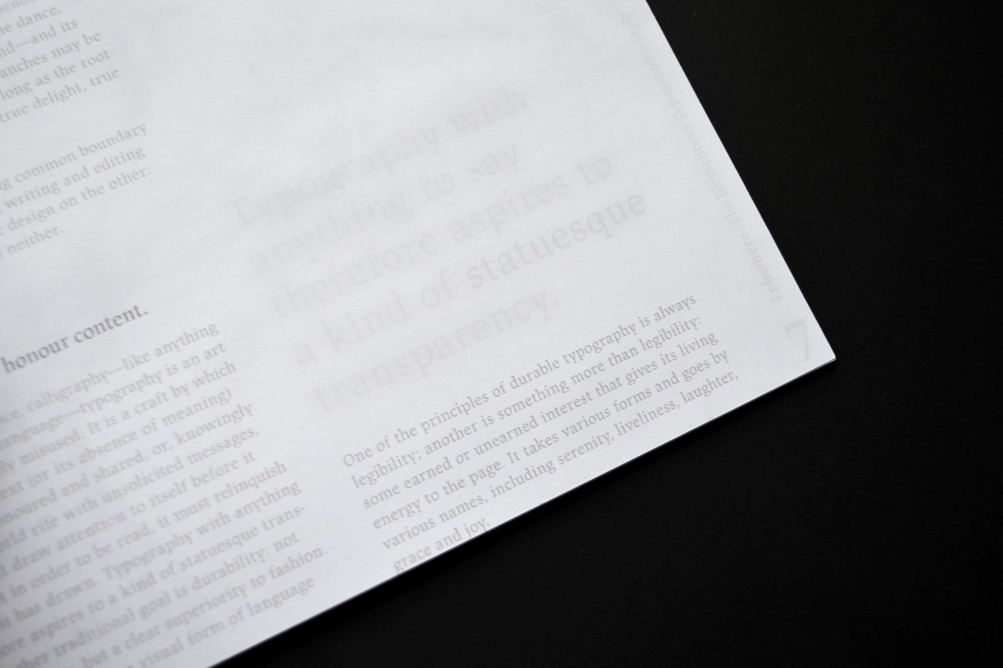
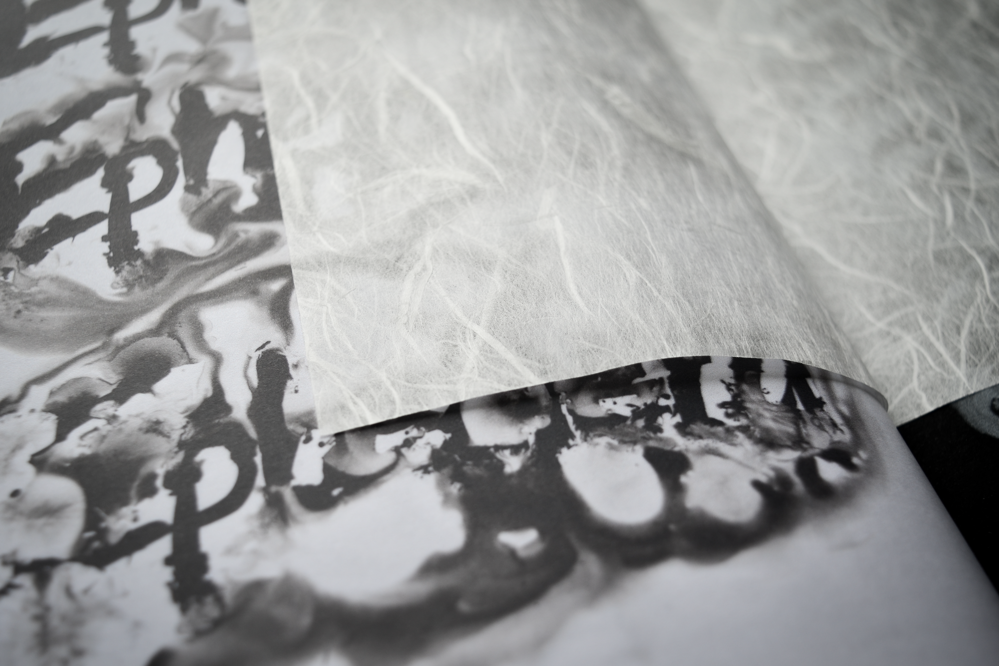
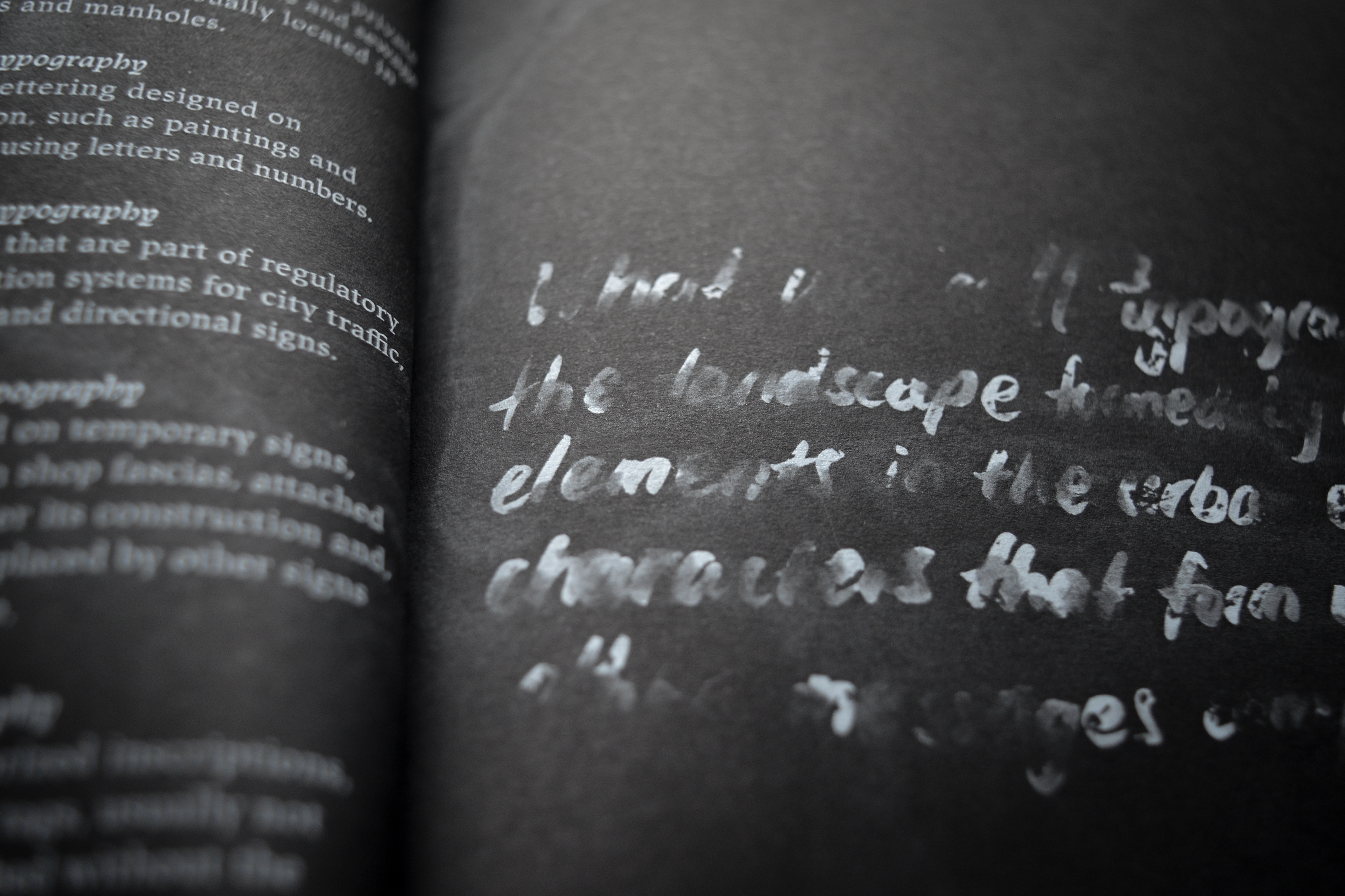
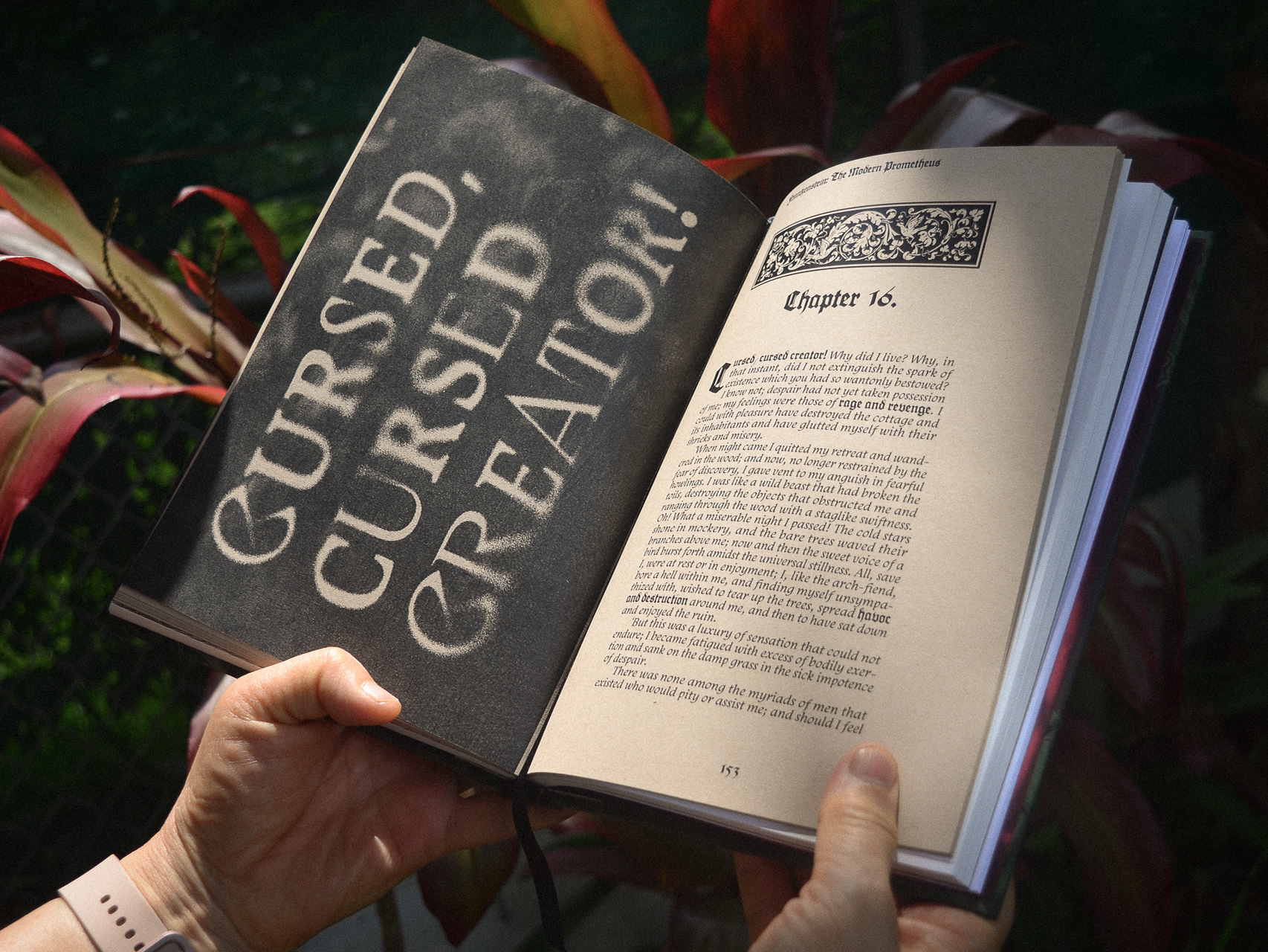
The publication explores the theme of transience by mirroring the decay of typography and the passage of time. This concept is embodied in the physical form of the magazine itself, which is a series of sheets bound together using Japanese stab binding. The fragility of paper, subject to the forces of time, reflects the transient nature of urban and human connections. Printed with specialty white ink on matte black paper, the use of these materials creates a stark contrast that visually represents the fragility of both typography and human history. The abstract visuals created by inks and hand-generated type further add to the ephemeral quality of the publication, reinforcing the theme of impermanence that runs throughout the design.
The publication explores the theme of transience by mirroring the decay of typography and the passage of time. This concept is embodied in the physical form of the magazine itself, which is a series of sheets bound together using Japanese stab binding. The fragility of paper, subject to the forces of time, reflects the transient nature of urban and human connections. Printed with specialty white ink on matte black paper, the use of these materials creates a stark contrast that visually represents the fragility of both typography and human history. The abstract visuals created by inks and hand-generated type further add to the ephemeral quality of the publication, reinforcing the theme of impermanence that runs throughout the design.
