Amplifying Voices in Frankenstein
UTS Honours Project
Date
2023
2023
Type of Work
Layout Design
Print & Publication
Book Design
Layout Design
Print & Publication
Book Design
Brief
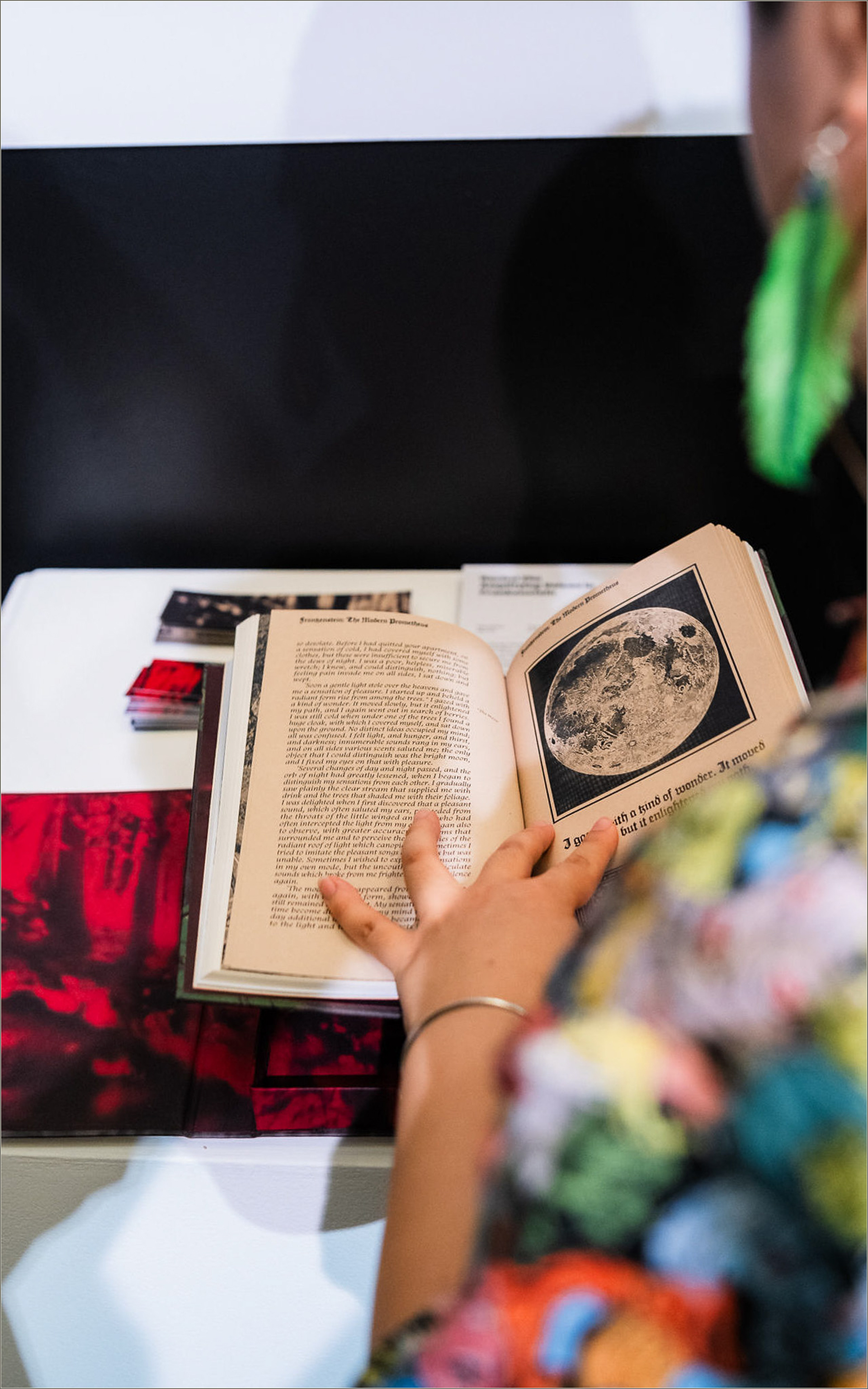
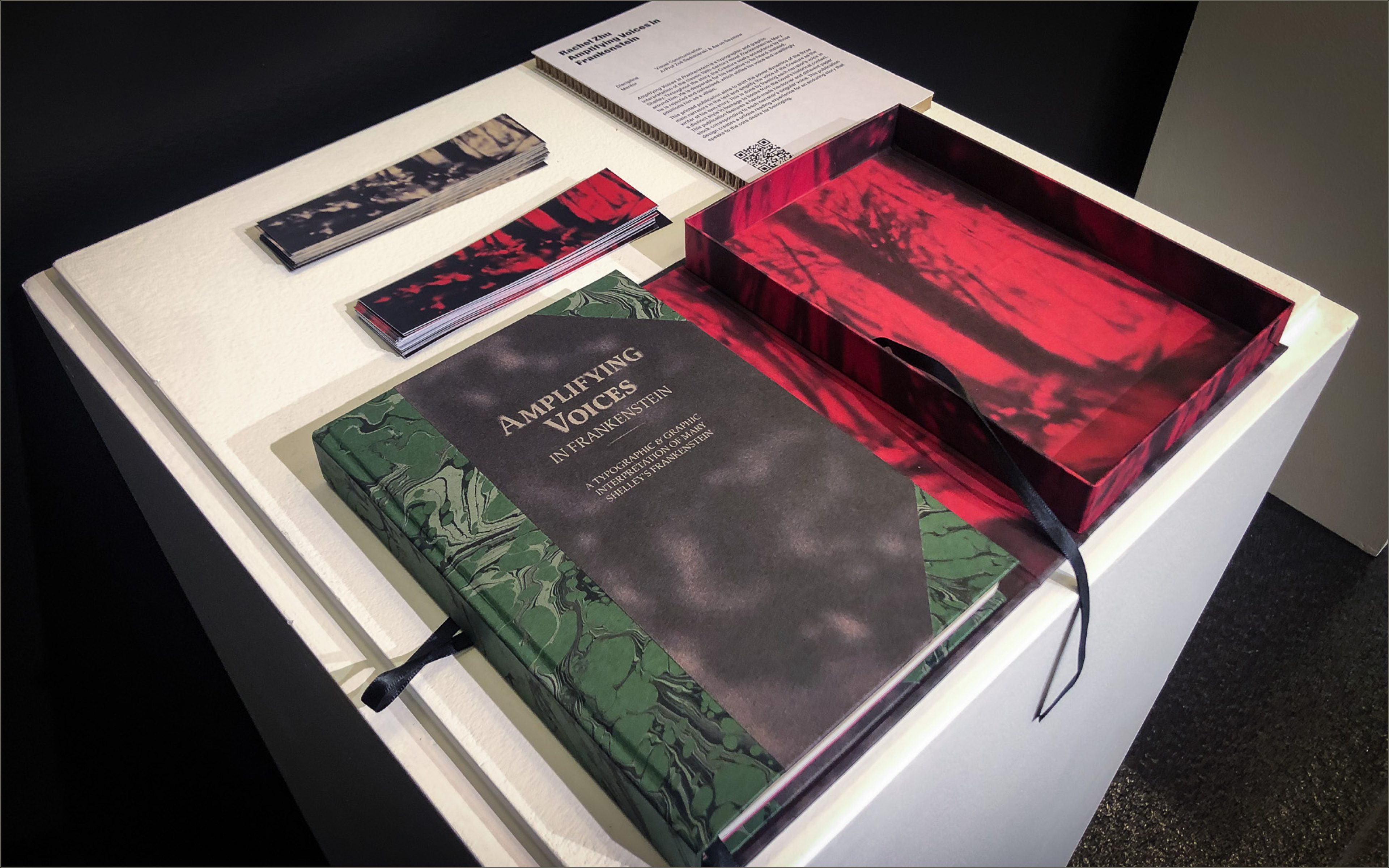
Amplifying Voices in Frankenstein is a typographic and graphic reinterpretation of Mary Shelley’s 19th-century classic Frankenstein. This printed publication seeks to shift the power dynamics among the three main narrators in the text, amplifying the voice of the Creature as the writer of his own story. Each narrator’s voice is given a distinct style, paying homage to the historical context of books from the novel’s era.
Amplifying Voices in Frankenstein is a typographic and graphic reinterpretation of Mary Shelley’s 19th-century classic Frankenstein. This printed publication seeks to shift the power dynamics among the three main narrators in the text, amplifying the voice of the Creature as the writer of his own story. Each narrator’s voice is given a distinct style, paying homage to the historical context of books from the novel’s era.
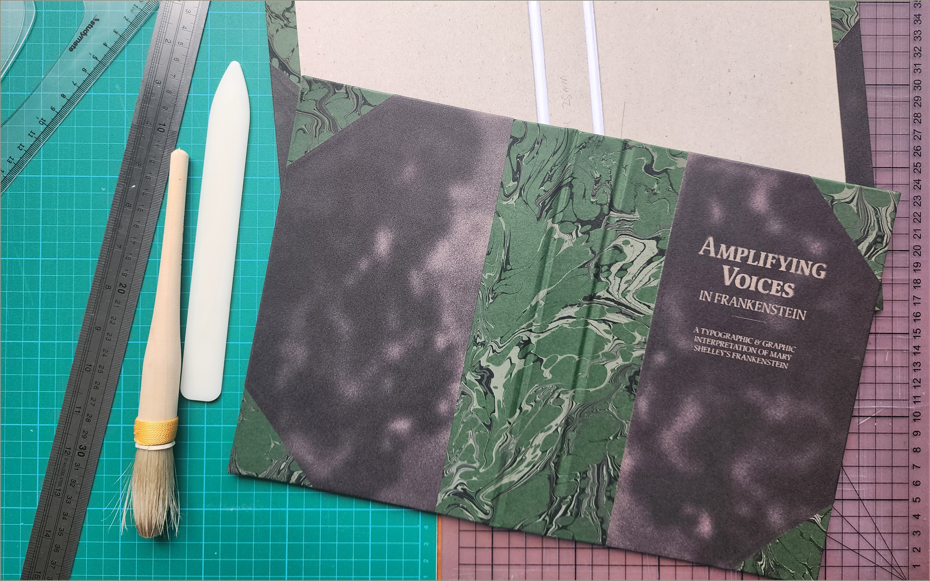
The publication features a handcrafted hardcover and case, with different paper stocks that correspond to each narrator’s voice, creating a unique reading experience for a timeless story that speaks to core desires for belonging.
Strategy
The aim of this 268-page publication is to retell Frankenstein through its paratext: its physical form, typography, layout, and visual elements, with a focus on amplifying the Creature’s voice and emotional journey. By distinguishing the three narrators, the project positions the Creature as the protagonist of his own story.
The aim of this 268-page publication is to retell Frankenstein through its paratext: its physical form, typography, layout, and visual elements, with a focus on amplifying the Creature’s voice and emotional journey. By distinguishing the three narrators, the project positions the Creature as the protagonist of his own story.
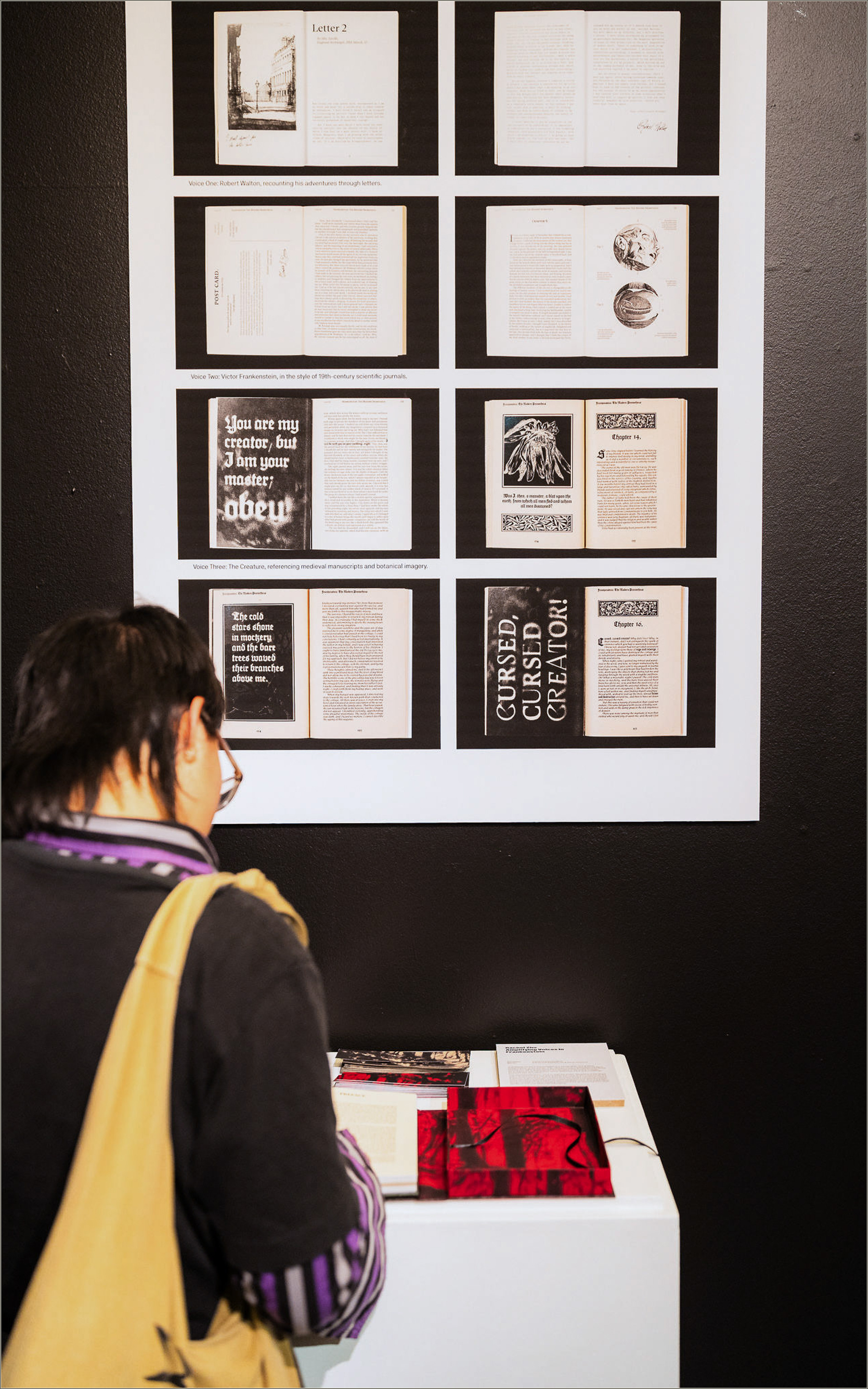
The book is divided into five sections, each told from the perspective of one of the three narrators. These voices are differentiated by varying paper types, typography, and layout. Historical books from the 19th century, as well as archival images, inspired the design to evoke the experience of reading Frankenstein through the distinct lens of each narrator.
The Creature
The primary focus of the project is the Creature: a being born into the world without purpose, subjected to prejudice and vilification. Botanical imagery and calligraphic typography, inspired by medieval manuscripts, are used to represent the Creature as the most expressive and “human” of the three narrators. His section is printed on kraft paper.
Victor Frankenstein
Victor Frankenstein, the ambitious scientist whose creation spirals out of his control, narrates his story through the lens of 19th-century scientific journals. A serif font is chosen to reflect the classical style of Victorian texts. The slight unevenness of the letterforms hints at Victor’s deteriorating mental state as the story progresses. His sections are printed on recycled cream paper.
Robert Walton
Robert Walton, the youthful explorer who encounters Victor Frankenstein in the Arctic, tells his story through letters to his sister in England. A typewriter font, paired with sketchbook-like illustrations, captures the aesthetic of letters from that period.
All illustrations in the publication are archival images sourced from the public domain, with the endpages illustrated digitally.
This project was featured in the UTS Design Honours Showcase.

Reflection
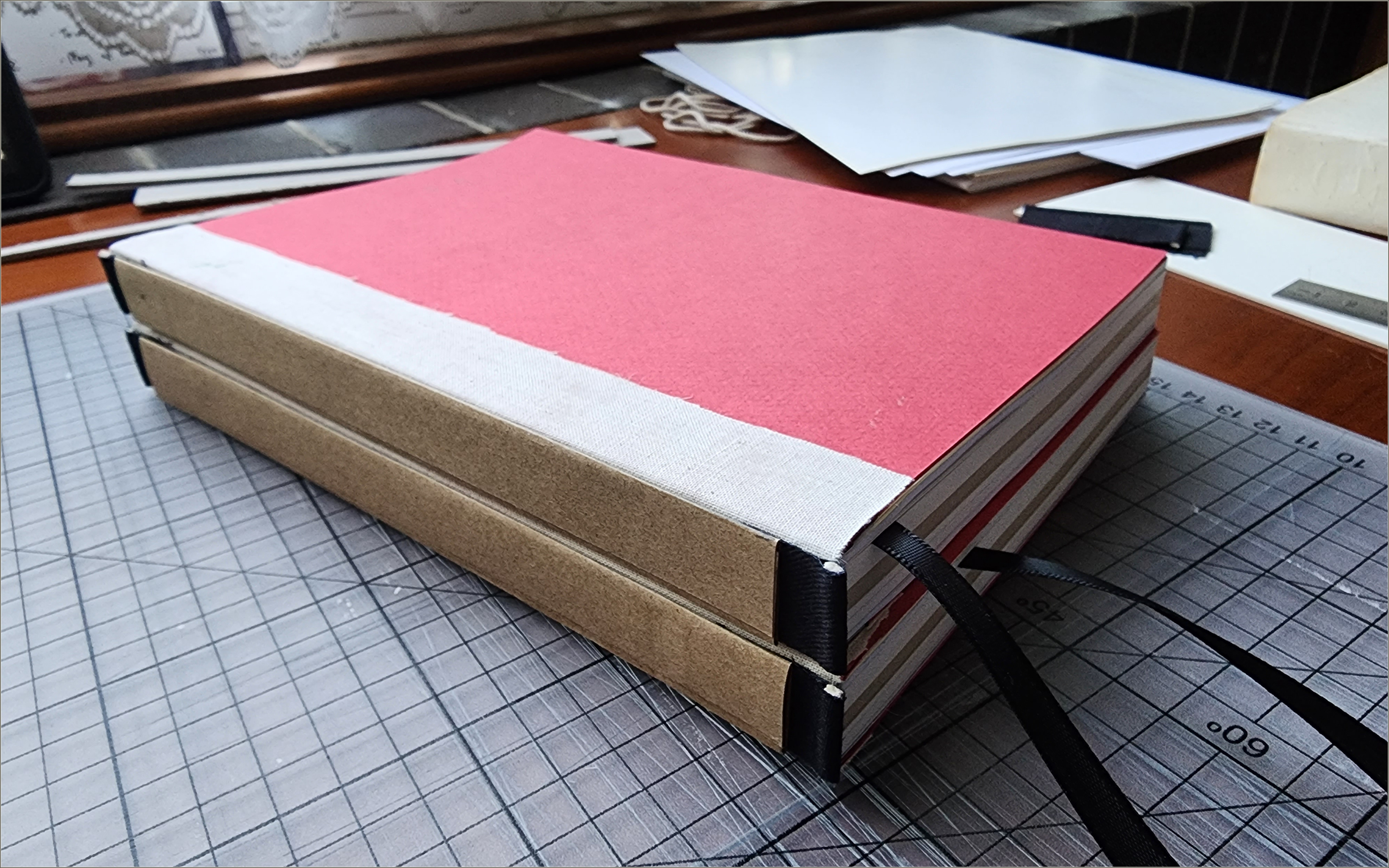
This project taught me valuable skills in setting up publication files for print and emphasised the importance of communication with printers. Collaborating with the team at UTS Digital Imaging Services and receiving guidance from my mentors was key to bringing this publication to life. Additionally, the advice from the bookbinder at Andersen’s Bindery was instrumental in the book’s creation. Through constant iterations, test prints, and revisiting both the printer and the art shop, the project ultimately succeeded.
This project taught me valuable skills in setting up publication files for print and emphasised the importance of communication with printers. Collaborating with the team at UTS Digital Imaging Services and receiving guidance from my mentors was key to bringing this publication to life. Additionally, the advice from the bookbinder at Andersen’s Bindery was instrumental in the book’s creation. Through constant iterations, test prints, and revisiting both the printer and the art shop, the project ultimately succeeded.
The trial version of Arizona Serif was used for education purposes and can be found here: https://abcdinamo.com/typefaces/arizona
Special thanks to all the support from my mentors, peers, friends and family.

